This is how my zine looked when I had printed it out on A2 paper.
However I hadn’t realised the images I’d had at the top were the wrong way round..
So I had to print it again.
Once I had folded the zine, I added the slit and proceeded to fold into the final product:


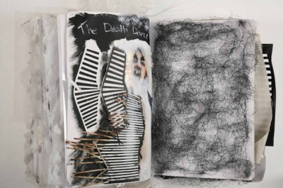
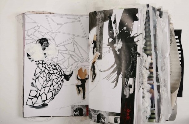
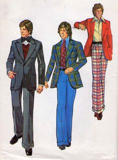
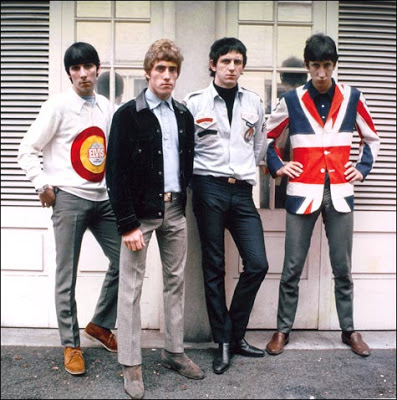
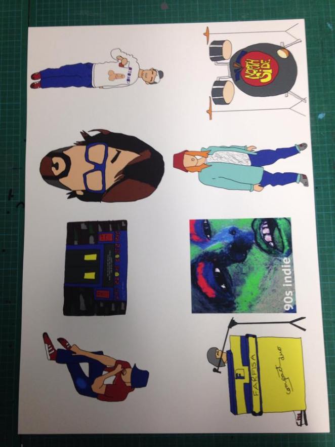
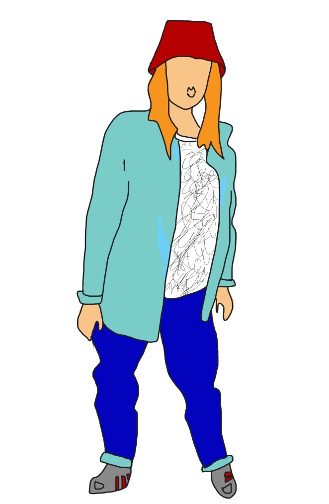
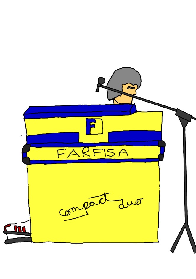
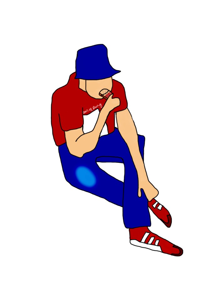
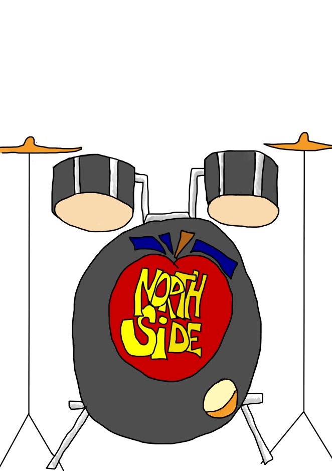
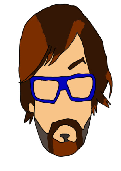
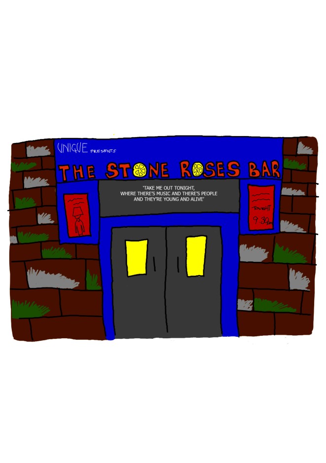
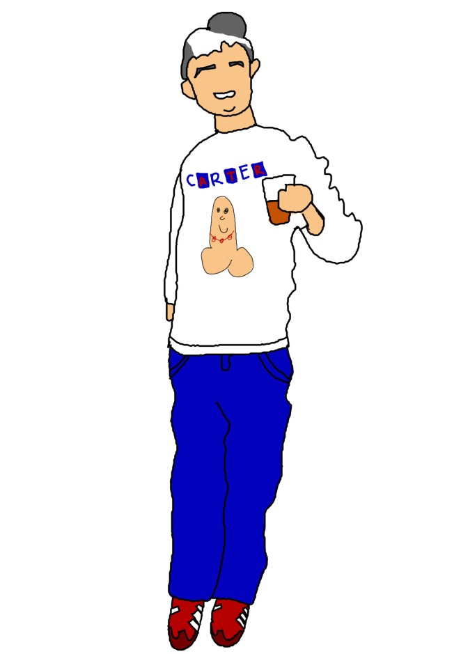
I am happy with my zine as a whole, however the 3 illustrations that have scruffier lines let it down a little.

![IMG_3031[1]](https://shannonmossblog.files.wordpress.com/2015/11/img_30311.jpg?w=662)
![IMG_3032[1]](https://shannonmossblog.files.wordpress.com/2015/11/img_30321.jpg?w=662)
![IMG_3033[1]](https://shannonmossblog.files.wordpress.com/2015/11/img_30331.jpg?w=662)
![IMG_3034[1]](https://shannonmossblog.files.wordpress.com/2015/11/img_30341.jpg?w=662)
![IMG_3026[1]](https://shannonmossblog.files.wordpress.com/2015/11/img_30261.jpg?w=662)
![IMG_3029[1]](https://shannonmossblog.files.wordpress.com/2015/11/img_30291.jpg?w=662)
![IMG_3027[1]](https://shannonmossblog.files.wordpress.com/2015/11/img_30271.jpg?w=662)
![IMG_3028[1]](https://shannonmossblog.files.wordpress.com/2015/11/img_30281.jpg?w=662)
![IMG_2993[1]](https://shannonmossblog.files.wordpress.com/2015/11/img_29931.jpg?w=327&resize=327%2C436&h=436#038;h=436 "IMG_2993[1]")
![IMG_2994[1]](https://shannonmossblog.files.wordpress.com/2015/11/img_29941.jpg?w=327&resize=327%2C436&h=436#038;h=436 "IMG_2994[1]")
![IMG_2985[1].JPG](https://shannonmossblog.files.wordpress.com/2015/11/img_29851.jpg?w=3264)
![IMG_2991[1]](https://shannonmossblog.files.wordpress.com/2015/11/img_29911.jpg?w=662)
![IMG_2987[1]](https://shannonmossblog.files.wordpress.com/2015/11/img_29871.jpg?w=662)
![IMG_2988[1]](https://shannonmossblog.files.wordpress.com/2015/11/img_29881.jpg?w=662)
![IMG_2989[1].JPG](https://shannonmossblog.files.wordpress.com/2015/11/img_29891.jpg?w=3264)