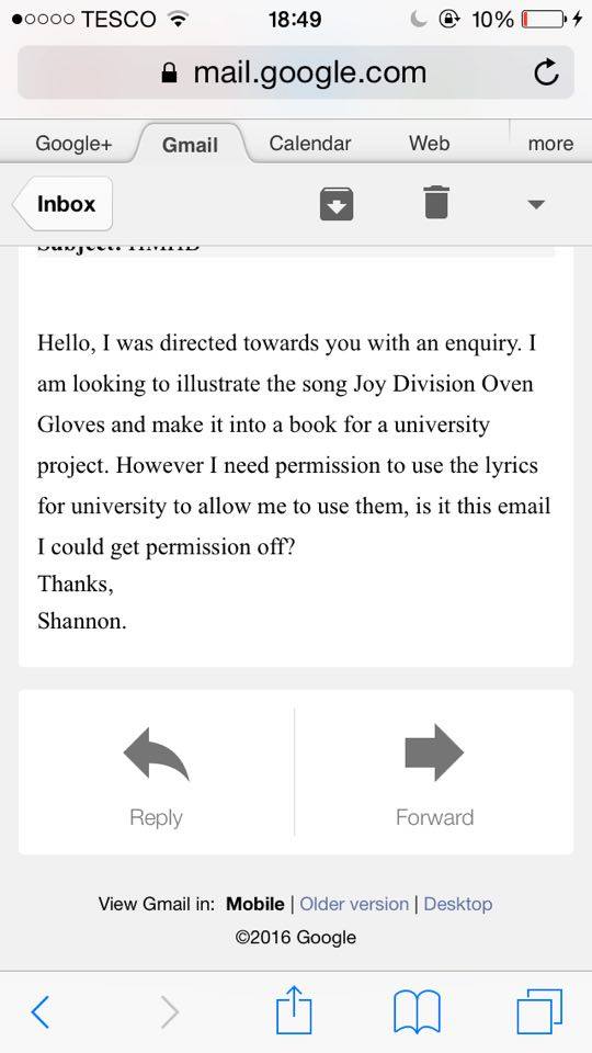
As the song I want to use is in copyright I had to get permission from the band to use them in my book.
Emails between I and the manager for Half Man Half Biscuit:
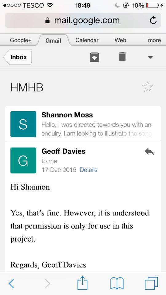
As the song I want to use is in copyright I had to get permission from the band to use them in my book.
Emails between I and the manager for Half Man Half Biscuit:
This book was first brought to my attention by one of my class mates, when I read it not only did I fall in love with the illustrations but the story also.
The illustrations in this book are in black and white, which is why I liked them, and was originally one of my own choices for my own illustrations.


These illustrations, to me, seem quite traditional. They remind me of the illustrations that appear in Roald Dahl books. The drawings are very different to my own style but I feel they fit the story for this book, which I want people to think when they look at my own. Also I feel the quality of these illustrations is very high, and of a quality I think I would struggle to achieve in the length of time given. It seems these illustrations are also done digitally, where as mine will be drawn with biro and then scanned in.
I like how the inside of the book has no colour but the cover does, I want the opposite of this for my book. Having a black and white cover, but then colour features inside.
Again the whole page is used for these illustrations which is different to how I want mine to be presented. However I think these illustrations are lovely and inspiring.
I also found this in Waterstone’s, and was drawn to it by the illustration on the front. It features a little circle person, drawn in black, with an orange jumper. This is closer to the illustrations I want to produce as it has a featured colour among black and white drawings.


Like the previous book I looked at, these illustrations are also very simple. However they have been created using different techniques. These illustrations look as though they’ve been drawn digitally.
Although I want my drawings to have a feature colour like these ones, I want each illustration to be within a box on the page, different to this book as these are presented using the whole page.
This is an illustrated book I found in Waterstone’s, I was attracted to it by the fact it was illustrated using (mostly) only blue. I want my book to involve minimal colours so decided to look at this book for inspiration.


I love the style of these illustrations as they appear very simple, it looks as though each person or object is built up of different shapes in different shades of blue. I like the way this looks and I too want my illustrations to be simple, however I won’t use the technique of building up shapes to create this.
This book also only uses blue (mostly), I would like more colours to feature in my illustrations, however I don’t want the full illustration to be coloured. After experimenting with black and white, full colour and having one feature colour, I decided that having one feature colour and the rest black and white looked the best.
I found this book on sale in the library As it is a collections photobook, and I’m also making a collections photobook I decided to buy it as research.


The book is a collection of figures Pilkington has photographed from an exhibition, although this doesn’t tie in with the theme of my photo-book, it is still a collection.
I love how strange these models are, and it gives the book a very creepy feel. This is not something I want to be reflected in my own work, however I think it is cleverly done.
There are not many images in this book, and though mine will have 20 pages, I feel this book captures an atmosphere in the little pages it has. I would like people to gain a certain atmosphere from my book, maybe nostalgia, or recognise a band that brings back memories.
During this lesson we has to create an 8 page book, in around 10 minutes, using illustrations from a storyboard from a previous lesson. The aim of this task was to use our imaginations to make a story from illustrations that in the begginning had no meaning.
Here is my book:
![IMG_3160[1]](https://shannonmossblog.files.wordpress.com/2015/12/img_31601.jpg?w=662)
![IMG_3161[1]](https://shannonmossblog.files.wordpress.com/2015/12/img_31611.jpg?w=662)
![IMG_3162[1]](https://shannonmossblog.files.wordpress.com/2015/12/img_31621.jpg?w=662)
![IMG_3163[1]](https://shannonmossblog.files.wordpress.com/2015/12/img_31631.jpg?w=662)
![IMG_3164[1]](https://shannonmossblog.files.wordpress.com/2015/12/img_31641.jpg?w=662)
I think doing this exercise also gave me more of an insight to what my style of illustration is. I enjoyed this exercise and it has given me more motivated for my illustrated book.
For my illustrative book I have chosen to do a song. As soon as this project was breifed I thought of this song instantly, I think it will be great to illustrate.
Half Man Half Biscuit – Joy Division Oven Gloves.
Well they say she’s too hot
Yeah well guess what
I’ve got Joy Division oven gloves
If it’s her desire
I’ll put my fingers in the fire
‘Cos I’ve got Joy Division oven gloves
I’ve got Joy Division oven gloves
Ooh ooh tropical diseases
Ooh ooh chemical alarm
Ooh ooh I’m a little blase
In me Joy Division oven gloves
In me Joy Division oven gloves
I’ve been here and I’ve been there
In me Joy Division oven gloves
I’ve been to a post-punk postcard fair
In me Joy Division oven gloves
Ooh ooh Nagasaki towpath
Ooh ooh tickling the laird
Ooh ooh checking out the Quantocks
In me Joy Division oven gloves
In me Joy Division oven gloves
On a sinking ship a sailor yearns
For his Joy Division oven gloves
Nero fiddles while Gordon Burns
In his Joy Division oven gloves
Talk to the hands, talk to the hands
In his Joy Division oven gloves
Dance dance dance dance
In your Joy Division oven gloves
Ooh ooh piccalilli shinpads
Ooh ooh polishing the nave
I keep wicket for the Quakers
In me Joy Division oven gloves
In me Joy Division oven gloves
In me Joy Division oven gloves
In me Joy Division oven gloves
In me Joy Division oven gloves
In me Joy Division oven gloves
In me Joy Division oven gloves
In me Joy Division oven gloves
In me Joy Division oven gloves
In me Joy Division oven gloves
In me Joy Division oven gloves
In me Joy Division oven gloves
My grandfather’s clock was too tall for the shelf
So I sold it and opened up a stall
Selling Joy Division oven gloves
We got Joy Division oven gloves
Get your Joy Division oven gloves
Hallelujah
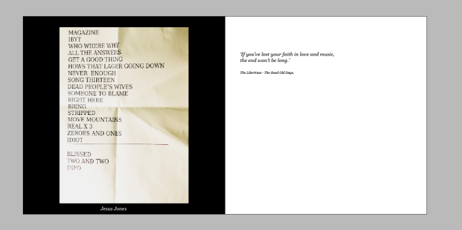
Here is how I would like the pages of my photobook to look, I have included all the decisions made about font etc.
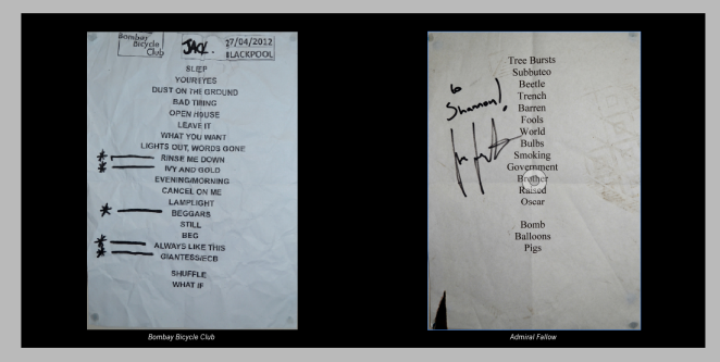
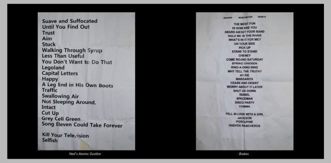
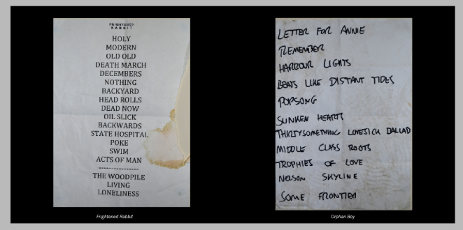
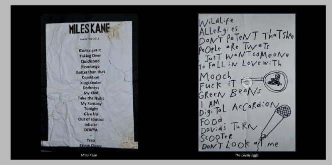
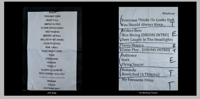
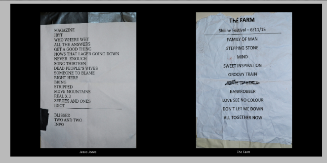
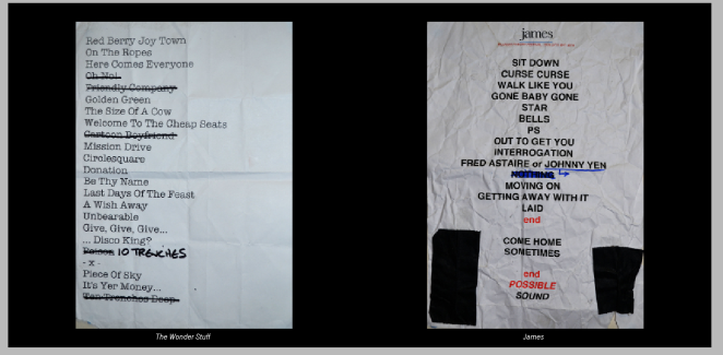
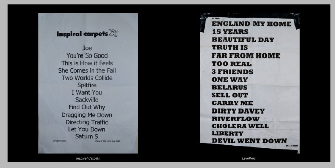
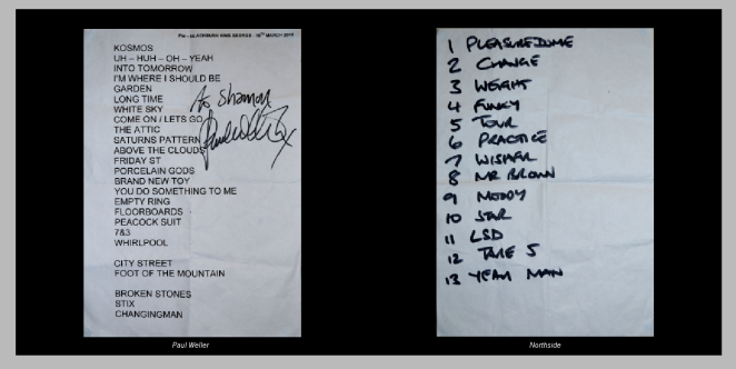
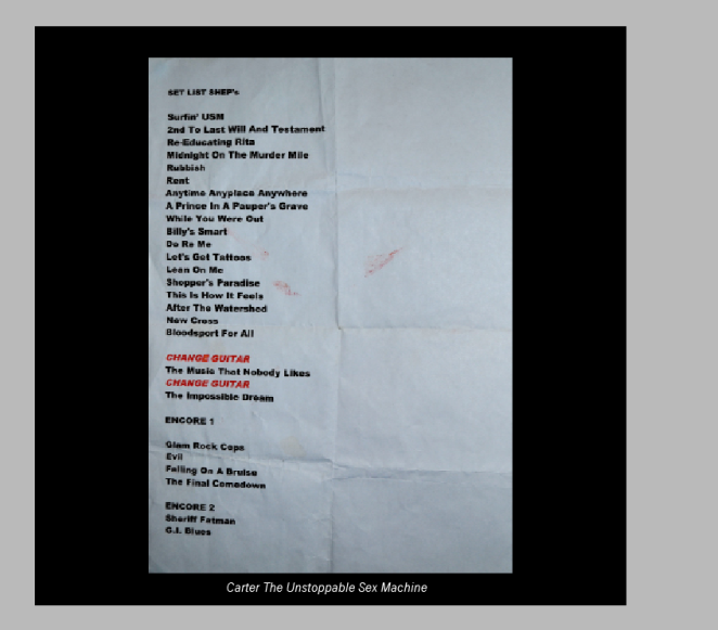
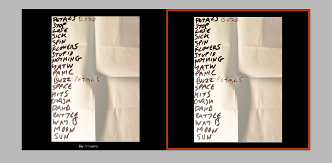
I decided to fill my photo book with images of set-lists I have collected over the years from different gigs.
I started out taking photo’s of my set-lists against a black background and shining light over one side (in a dim room):
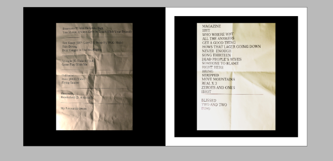
After looking at different ways I could lay out my pages on InDesign, I decided this wasn’t how I wanted my images to look:
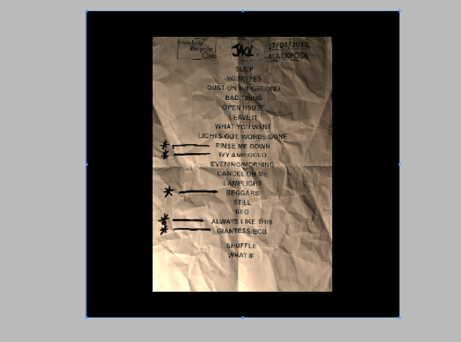
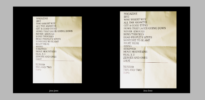
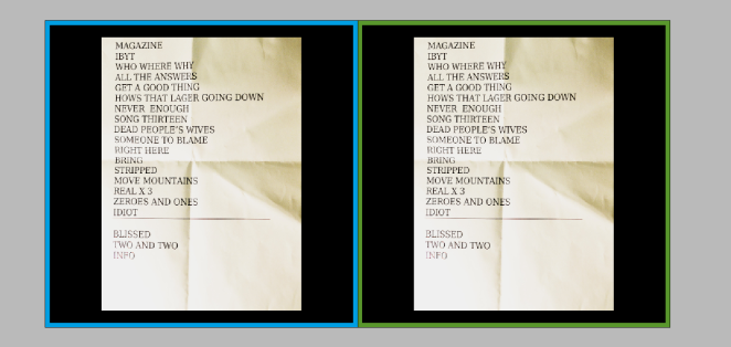
I started looking at displaying the image on a black background, and the different sizes the image could be. I prefered this layout, however the images I had taken were too dark for this layout so I had to take them again. I also like how there’s space around the imgae, much like the images in The Polaroid Book, which I was quite inspired by.
I also looked at having the image with a coloured border. Although I like the aesthetic of this, people may confuse it to have meaning and relationship to the image. I also think having different colours around each image looks a little childish and takes the professionalism out of the over all look.
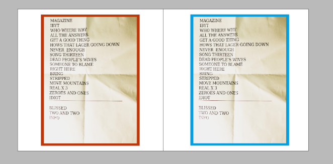
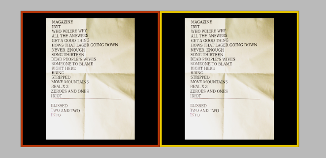
I think if I was to stick to one colour of the border it would look better, however I do prefer the images on just a black background.
After this I looked at having text underneath the images, stating which band the set-list is from. I looked at what font I would want this in and also looked at a font for my sentence at the beginning of my book.
The first font (on the left) is Gill Sans and the second (on the right) is Manion Pro. I have put the text in italic also as I think it gives a good finish. I prefer the font to the left as I think the one on the right looks a little biblical. Also the font on the left has flaws, I don’t like the way the J is as it comes down below the other letters.
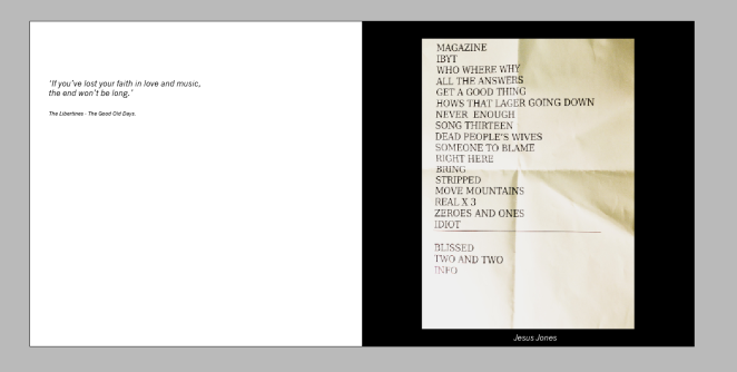
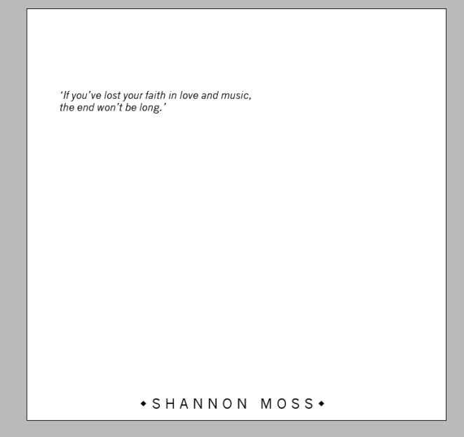
This font is News Gothic MT, again I have made it italic. The above also shows the sentence/quote I would like to include. I have chose this quote as I see it to be fitting as through this book I am expressing my love of music. I like this font as I think it looks crisp and professional, it looks clean on the page and goes well with the overall aesthetic.
This font is Georgia and it is not too dissimilar to Manion Pro. Again I think this font looks Biblical, however I did like it when I was first choosing fonts for the text. I do prefer this font to the Manion Pro font but will not be using it in my final book.
The font I will use for my final is News Gothic MT.
Next I looked at how I want my front cover to look.

The first cover I like as it is neat and smart, this is using the same font I had chosen above. The only thing with this choice is it doesn’t have my name on. I like the second cover, however I don’t think the G’s go well with the I as they are much bigger letters.
This cover includes my name, however I think having my name on the cover takes away from the classiness.
I am going to chose the first cover for my final, and include my name on the first page along with my quote.
This is a single image of a collection of keys. I have decided to look at this as it fits in more with my subject. this is a collection of objects which essentially mine is too.
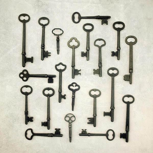
I think the image is aesthetically pleasing, the way the keys are placed in different ways keeps the eyes occupied. It is easy to look at also. Although I will have several images in a book format I would like the audience to feel my work is too aesthetically pleasing and easy to look at.
