Debate.

For this task I decided to watch a TED debate about nuclear energy and whether it was needed or not.


Screen Shot 2016-05-19 at 15.14.21.png


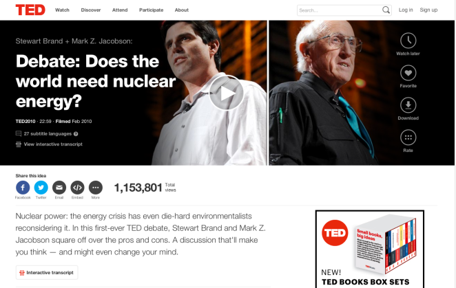
At the start of the debate the audience was asked to state whether or not they were in favour of nuclear energy – it was found that 75% of people were in favour and 25% were not.

First to speak was Stewart Brand who was in favour if nuclear energy, here are some points he made to try and make people agree with him:

  • Nuclear energy is more environmental than coal and gas
  • It produces less waste than coal and gas
  • Nuclear waste doesn’t cause pollution, other means of energy emit a lot of co2
  • He talks about how nuclear energy can be used for nuclear weapons, and these have helped fight off Russian war lords


Next to speak was Proff. Mark Jacobson, who was against nuclear energy and in favour of wind and solar energy. Here are some of his points:

  • Nuclear energy takes along time to set up and get running, in total about 10-19 years
  • Because of the above nuclear energy ends up giving off more co2
  • Nuclear terrorism and war causes over 270,000 deaths
  • Wind energy has a small footprint and doesn’t take up that much space, it can also be placed in the sea which isn’t even land
  • Wind energy is much less harmful
  • Nuclear energy requires uranium mining
  • Using wind and solar energy will prevent the ice caps from melting


At the end of this debate it was again asked who was in favour of nuclear energy, it turned out that 10% of the audience had changed their minds during the debate and would now prefer wind and solar energy.

I personally agree with the second speaker, this is because using wind and solar energy could restore the ice caps and the damage we have already done to the earth. Also we are vastly running out of materials to use for other kinds of energy. Having to dig up uranium mines just for energy seems silly and looks worse than solar panels or wind turbines.


Library Task.

For the library task I was drawn to a book called ‘Knickers, An Intimate Appraisal’ by Rosemary Hawthorne.

Not only do I like the illustrations in this book I learnt a lot of things I hand’t known before.

One of these things is that knickers have only been around for just over 200 years. This book discusses the changes knickers had, going from pantaloons to g-strings. It was the last decade of the 18th century women started to care about wearing knickers and those who wore them before this were discriminated against.

I found it interesting how knickers have gone from being knee length to barely anything and the reasoning behind this.


Here are some of the illustrations in the book:

IMG_4902.JPG

IMG_4903.JPG

IMG_4904.JPG

I like how sketchy these illustrations are, they also have a laugh factor about them too, which i like because essentially a book about knickers is fairly amusing.


Fallen Rose Media.

IMG_4898.PNG

Here is someone I follow on twitter who’s work I find very interesting. Although they do not post their photography on the twitter account itself there is a website in which I have looked on and found some of my favourite pictures.

IMG_4895.PNG

IMG_4896.PNG

IMG_4897.PNG

Fashion photography is something I am very interested in, I love everything involved from the actual photography to the fashion being displayed and the make up used also. I love these pictures as they have quite a vintage feel about them and I feel the models used are more relatable as they look like normal people compared to some models who make people feel bad about themselves.

I also love how they are shoot in a normal environment, this particular one a house. Although they are staged they still look natural.


Instagram.

I use Instagram as my main source of collecting artist work and looking at what is already out there. I feel it has a better format than twitter for looking at images and seen as I am mostly interested in photography this is better for me.

As well as a personal Instagram account, I have made one specifically for my professional practice too. This is where I follow and look at other photographers too.

IMG_4891.PNG

Twitter Task.


IMG_4894.PNG

I already had a twitter, in which I used personally and professionally. I follow a range of artists/organisations I am interested in; here are a few of them.

IMG_4889.PNG

IMG_4890.PNG

IMG_4885.PNG

IMG_4887.PNG

As well as following these professional people, I also follow a lot of people who are doing art courses or are interested in art and design. I like this as I can relate to these people more, and share ideas with them.

Rome Tasks.


  1. Get a view of the city from up-high and document visually

DSC_1337.JPG

  1. Go underneath the city and document visually

DSC_1284.JPG

  1. Try a traditional Italian dish

IMG_4264.JPG

  1. Try a traditional Italian drink

DSC_1278.JPG


  1. Document two examples of Roman Design

DSC_1525.JPG

DSC_1462.JPG

  1. Document an example of Italian Futurism

IMG_4278.JPG

  1. Listen to some live local music. How does it make you feel?

DSC_1500.JPG

Made me feel happy, and amused.


  1. Say ‘please’ and ‘thank you’ in Italian to a local. What response do you get?

They were grateful I suppose, normal response as they get it everyday I guess.

  1. Get yourself a souvenir from Rome. Why did you choose it?

Ashtray, didn’t have one and they had proper tacky ones which looked mint.

  1. Document some street art

DSC_1215.JPGDSC_1217.JPGIMG_4303.JPG

  1. Visit one of Roman sites .What do you think of it?

DSC_1422.JPG

The Vatican – I thought it was amazing and all the ceilings had such detail it’s amazing to think it was all hand done, must’ve took ages. Above is my fav roof.

  1. Go to and document a market

DSC_1476.JPGDSC_1475.JPG

Jackson Pollock – TATE

In Liverpool I visited the Jackson Pollock exhibition. Overall I thought the pieces were fantastic and really appealed to me. I think some of this was the contrast between each piece, some would be bursting with colour while others would be black and white but still beautiful pieces. I thought this was excellent as, to me, it showed it wasn’t necessarily about colour, it had deeper meaning.

Also in Pollock’s paintings there would be hidden people or animals, whether this was intentional I don’t know and it wasn’t stated, but it meant the painting could show different things depending on your distance. I found this aspect quite entertaining, looking and guessing what the shapes made.

As well as this, the paintings reminded me of John Squire’s work, I later found out Squire was heavily influenced by Pollock. This for me made the exhibition better, looking back, as I feel I can relate to it more, even though the two artists have different meanings behind their work.

I think Pollock’s paintings have meaning in a way that they reflect mental state, but I don’t think they have deeper meaning or have much background behind them. He just did them. I liked this because this is a way I work most of the time.

Although the paintings were great, I thought the layout of the exhibition was confusing. I thought there needed to be more information as you went round about how he transitioned from piece to piece, and a more clear sort of path around the exhibition.