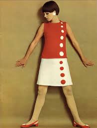
Brief: Visually communicate what the country would be like without a monarchy.
Context: Three-quarters of the population want Britain to remain a monarchy, however does this statistic support the monarchy or The Queen? It is an outdated institution that isn’t appropriate for the 21st century. There are many for and against arguments, including things to do with tax, the church and tourism. I personally think the monarchy is irrelevant and that The Queen has no real power.
IDEAS:
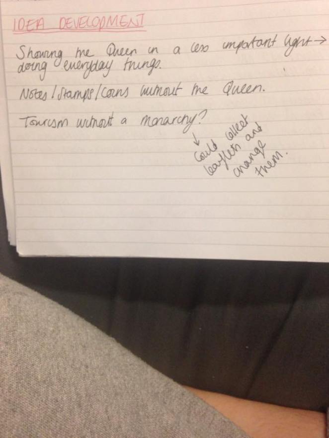
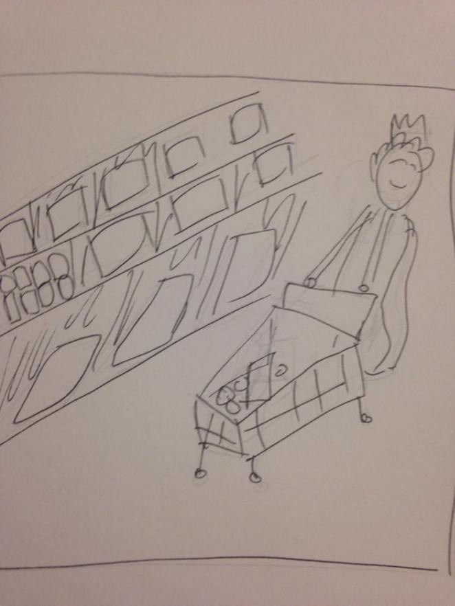
Queen shopping.
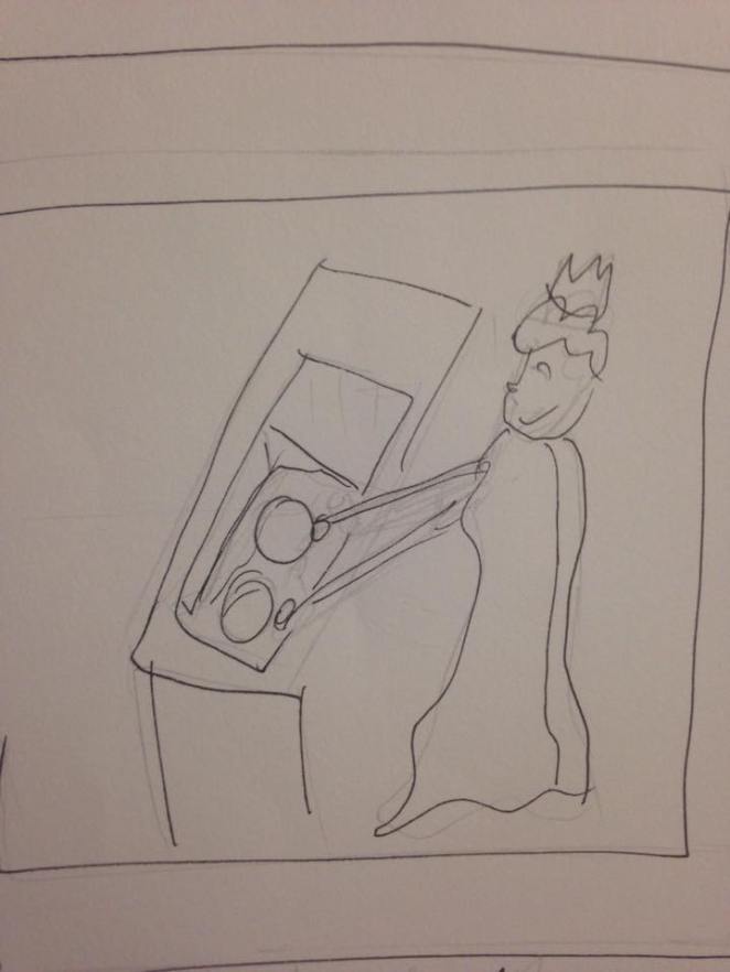
Queen washing up.
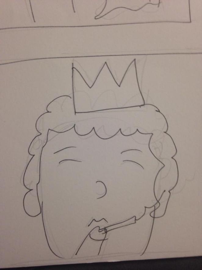
Queen smoking.
I would create these using photography and a model dressed up as the queen, i could do many more of this sort with different activities.
After showing my initial sketches to peers, I gained feedback that they liked the idea and thought it would be effective but at the same time humorous. They preferred this idea to the ideas I had involving stamps and bank notes.


![IMG_3031[1]](https://shannonmossblog.files.wordpress.com/2015/11/img_30311.jpg?w=662)
![IMG_3032[1]](https://shannonmossblog.files.wordpress.com/2015/11/img_30321.jpg?w=662)
![IMG_3033[1]](https://shannonmossblog.files.wordpress.com/2015/11/img_30331.jpg?w=662)
![IMG_3034[1]](https://shannonmossblog.files.wordpress.com/2015/11/img_30341.jpg?w=662)
![IMG_3026[1]](https://shannonmossblog.files.wordpress.com/2015/11/img_30261.jpg?w=662)
![IMG_3029[1]](https://shannonmossblog.files.wordpress.com/2015/11/img_30291.jpg?w=662)
![IMG_3027[1]](https://shannonmossblog.files.wordpress.com/2015/11/img_30271.jpg?w=662)
![IMG_3028[1]](https://shannonmossblog.files.wordpress.com/2015/11/img_30281.jpg?w=662)
![IMG_2993[1]](https://shannonmossblog.files.wordpress.com/2015/11/img_29931.jpg?w=327&resize=327%2C436&h=436#038;h=436 "IMG_2993[1]")
![IMG_2994[1]](https://shannonmossblog.files.wordpress.com/2015/11/img_29941.jpg?w=327&resize=327%2C436&h=436#038;h=436 "IMG_2994[1]")


![IMG_2985[1].JPG](https://shannonmossblog.files.wordpress.com/2015/11/img_29851.jpg?w=3264)
![IMG_2991[1]](https://shannonmossblog.files.wordpress.com/2015/11/img_29911.jpg?w=662)
![IMG_2987[1]](https://shannonmossblog.files.wordpress.com/2015/11/img_29871.jpg?w=662)
![IMG_2988[1]](https://shannonmossblog.files.wordpress.com/2015/11/img_29881.jpg?w=662)
![IMG_2989[1].JPG](https://shannonmossblog.files.wordpress.com/2015/11/img_29891.jpg?w=3264)